The third part of a tutorial explaining how to develop a feature rich WordPress theme using only CSS.
Previous parts:
Navigation Areas
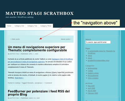
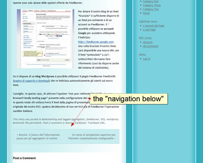
The navigation areas are two: one is placed above the content of the page; the other at the end. They contain links to previous and next posts.
CSS class .navigation is applied to both areas.
.navigation {
background-color:#C7EDF0;
padding:18px;
border: 1px solid #AECED2;
}
By applying a background color and a border to the class we style both with a single CSS rule.
We have to reset the width of two areas, too. It’s defined as 100% on Thematic Theme default.css. We have added paddings and, due to the CSS box model, the two areas are now more than 100% width. Unfortunately the two box width is not defined on .navigation class but un #nav-above and #nav-below IDs.
CSS rules applied to IDs are more specific than rules applied to classes. So we can’t write:
.navigation {
width:auto;
}
but we need to write:
#nav-above, #nav-below {
width:auto;
}
Let’s apply also some margins. Bottom margin on the “navigation-above” and top margin on the “navigation-below”.
#nav-above {
margin-bottom:24px;
}
#nav-below {
margin-top:24px;
}
We had to reset also a specific padding applied to pages that have .paged class applied to body
.paged #nav-above {
padding:18px; /* to reset the default */
}
Save and upload style.css to 3hoursTheme folder on your server themes folder.


Widget Areas
On Thematic Framework there are 13 widget-ready areas. For a comprehensive outlook of Thematic areas take a look at this Thematic page structure wireframe and at these three Widget Area maps (thanks to Danny).
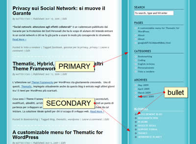
We apply a common style to widget titles on #primary and #secondary widget areas
/* common styles (both #primary and #secondary have .main-aside class*/
.main-aside h3.widgettitle{
font-weight:bold;/* bold */
text-transform:uppercase;/* uppercase */
font-style:normal;/* overwrite the default italic style */
margin-bottom:7px; /* a small margin on the bottom */
}
but we differentiate them by the colors:
/* primary is blu */
#primary h3.widgettitle{
color:#113242;/* color blue (same color of header background) */
border-bottom:1px solid #113242;/* a thin blue line on the bottom */
}

/* secondary is white */
#secondary h3.widgettitle{
color:#FFF;/* color white */
border-bottom:1px solid #FFF;/* a thin white line on the bottom */
}
Now we change text and link appearance on primary and secondary widget areas.
/* common text styles */
.main-aside{
font-size:12px;
color:#1A4E66;
}
.main-aside a{
text-decoration:none;/* links on both primary and secondary are not underlined */
font-weight:bold;
}
.main-aside a:active, .main-aside a:hover {
text-decoration:underline; /* but they are underlined on mouse over */
}

/* links on primary are blu */
#primary a{
color:#1A4E66;
}
#primary a:active, #primary a:hover{
color:#113242;
}
/* links on secondary are white and bold */
#secondary a {
color:#FFF;
text-transform:uppercase;
letter-spacing:0.05em;
}
Let’s style also the lists on widgets by adding bullet images (we can create them with almost every image editing software).
/* bullet images on list inside widgets */
#primary .widgetcontainer ul li {
list-style-image: url(images/bullet.png);
}
#secondary .widgetcontainer ul li {
list-style-image: url(images/bullet2.png);
}
Remember to upload the two images on 3HoursTheme/images folder on your server!
To complete the primary area styling we remove the border around it:
/* we remove the default border around #primary */
#primary {
border:none;
}
Below the result of our CSS editing.

Subsidiary widget areas are on header and footer that are blue so text must be lighter
/* subsidiary widget areas */
/* Widget Titles have same color of blog-description, text and links are white*/
#subsidiary  h3.widgettitle{
color: #B3E4E9;
}
#subsidiary, #subsidiary a{
color: #FFF;
}
Absolute positioning
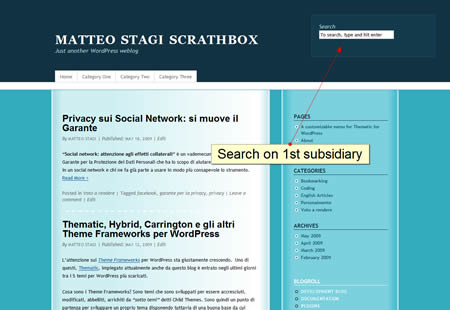
We do not need three widget areas on footer. But it would be cool to have it one on header to put there a search input.
By using absolute position we can entirely remove a div (or others XHTML box elements) from the normal flow of the document and move it everywhere we want.
The edges of absolutely position elements are defined by left, right, top and bottom CSS rules that specify the offset from the edge of the containing block.
The containing block is the nearest ancestor element with a position that is defined other than static
If no ancestor element has position defined, the containing block is the root element of the document: that is our case! left, right, top and bottom rules define offset from the border of the entire page.
/* we move the 1st Subsidiary (#subsidiary #first) on the header, where we can put search box or banners or whatever else*/
#subsidiary #first {
position:absolute;
right:20px;
top:40px;
z-index:1000; /* we put it on top, elsewhere it stays on the back and it doesn't appear*/
}

/* add a different backround and some borders to the 1st Subsidiary*/

#subsidiary #first {
background-color: #13394C;
border: 1px solid #1D5570;
padding:20px;
}
z-index is important for absolutely position elements, since they can overlap: it defines which elements is visible.
Save you style.css and upload. Go to Appearance -> Widget on WordPress administration panel. Remove “Search” from primary if presents and put it on “1st Subsidiary Aside”. Save and refresh your blog page.

Continue….
Learn to style the Superfish enabled menu of your Thematic Child Theme.
Part IV – Style the Superfish drop-down menu